I was approached by members of Harrowgate Hill Christian Fellowship, UK, to design a logo, branding, stationary, website and welcome pack for them.
NOTE: This article originally appeared on my personal design site, Andrew Kelsall Design.
The Design Brief
In short, I was to design a church logo design and coherent identity system that would work well across print and web. I was to design a logo, first and foremost, that would represent a sense of community in regards to the church. The design was to be both welcoming and contemporary—forming a platform where outreach to surrounding communities was key.
The Structure of this Post
The rest of this post shows both conceptual work and excerpts from proofs I sent to the client. All text in block-quotes shows how I described the designs to the client. The images roughly show the design process; taken from multiple PDF revisions.
The Church Logo Design Process
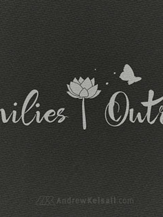
Here are the church logo designs I produced for Harrowgate Hill...
[…] All the logos are shown in just a dark-grey colour for now. This is so the formation of the logos can be assessed without the prejudice of possibly-incorrect colour choices affecting the appearance of the logos […]
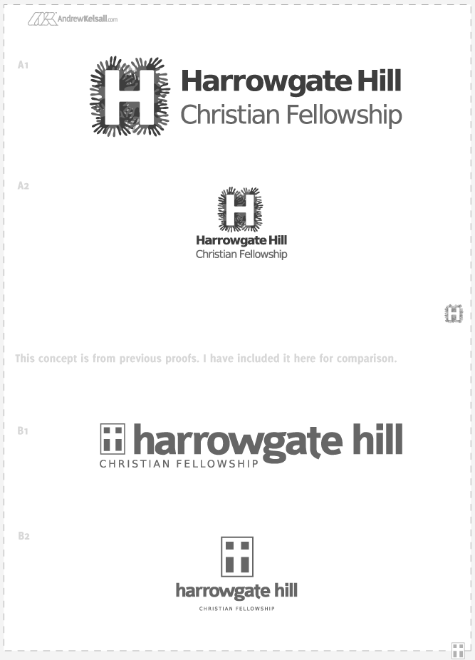
Above: First logo design concepts A+B
Concept A: I have designed this logo with a clear, modern, down-to-earth and friendly impression in-mind. The icon represents the Harrowgate Church at both the centre of the surrounding community—which forms a Cross. In another level of thought and perception, I intended the logo mark appear as though it’s a very abstract map of the surrounding housing and streets.
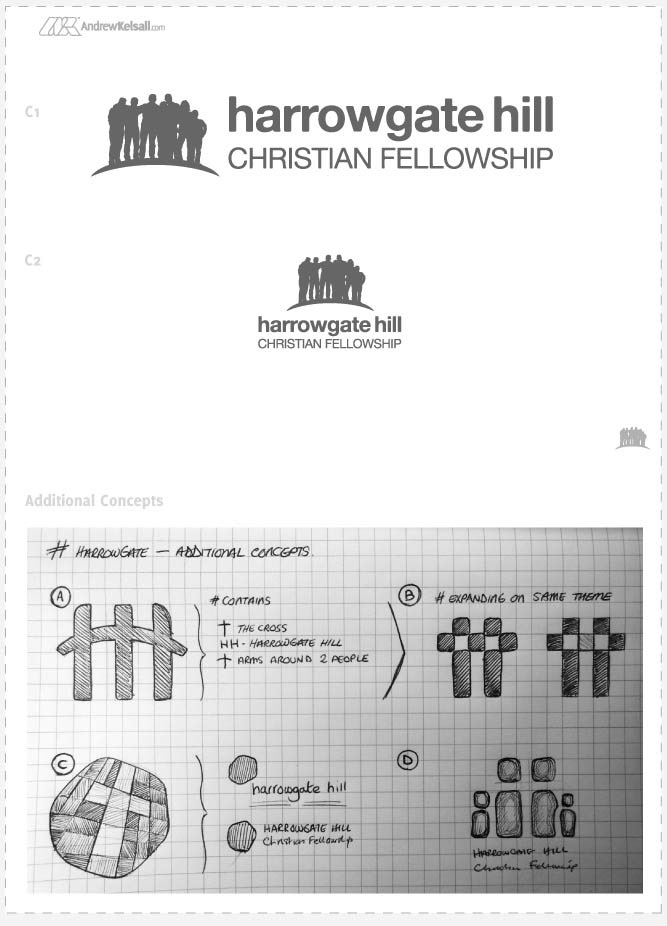
Above: First church logo design concepts, set C
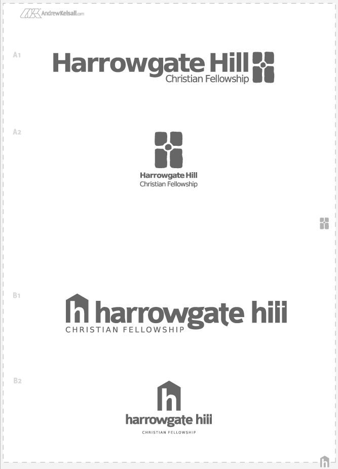
[…] All the logos show a revised logo icon, with another alternate version on page 6. I have experimented with different font combinations and using a lower-case “h” and an upper-case “H” on the first two pages.
Also, I have provided 3 different colour combinations for your review. As the logo icon is a silhouette, I have chosen dark colours that suit a silhouette style (as well as keeping the colours projector-friendly as requested) […]
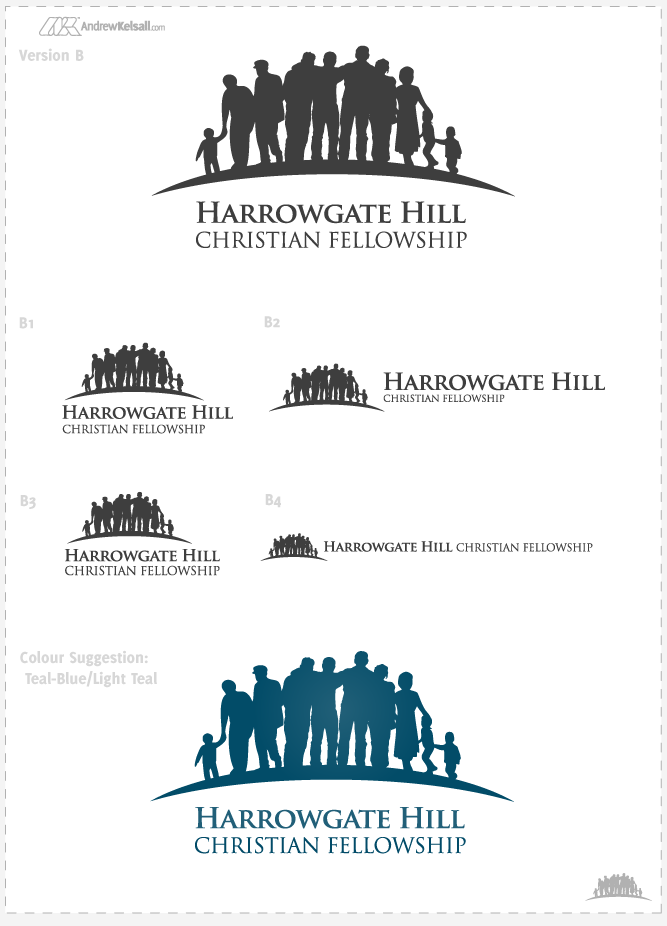
Above: Second church logo design concepts A+B
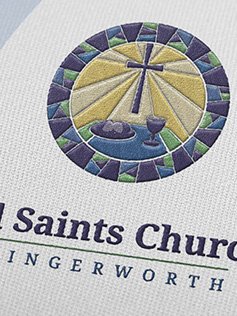
Concept B: This design builds on the friendly message of community-building. The name “harrowgate hill” is in lower-case letters to promote a sense of modernism and friendly attitude; “Christian Fellowship” is in all-caps to balance the typography and show solid authority and leadership. After looking into the whole “window on the community idea”, I designed a logo icon that is based on the windows you have installed in the HarrowGate building (I researched on Google Streetmaps and looked at the building from different angles). As can be seen, the windows also show a Cross.
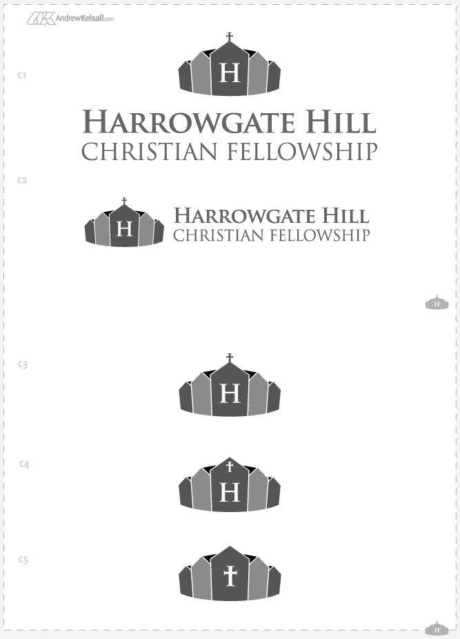
Above: Second logo design concepts, set C
Concept C: Again, after researching your local area with Google Streetmaps, I noticed how many houses there were surrounding the church. With this in mind, I designed a logo icon that is a crown made from terraced-houses with the Church at the centre. I have provided some variations with a mixture of “H” letters and Cross’s on the centre of the crown […]
Above: Logo set C colour variations
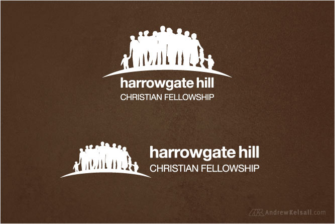
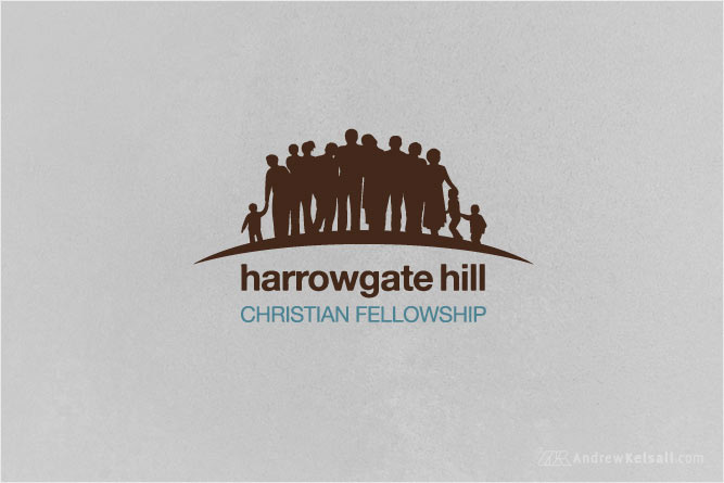
[…] I have taken out the figure with the flat cap and reworked the figure to suggest a youth or younger person resting his head on a man’s shoulder.
Without a flat cap, it is more difficult to define someone who is older, however, I have made subtle changes to the rest of the figures to give the impression that a group of people, from children to woman & men of varied ages are stood closely together. I have reviewed the images you sent with the suggestions and have included a woman holding a child as well.
The figures still need some refinement, but I will work on the refinement once the main design is ‘finalised’ […]
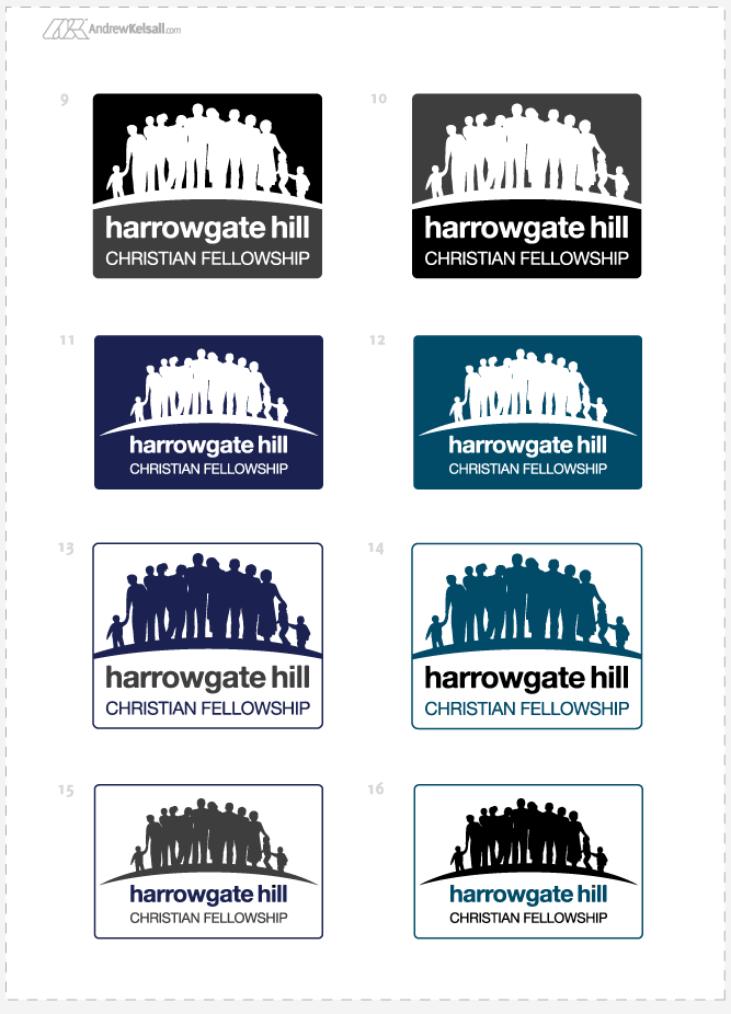
Above: Church logo design set C formation variations
Folder Design
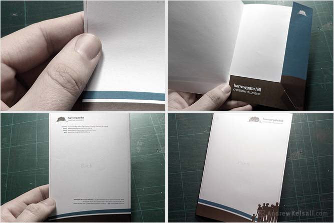
Above: I designed a welcome pack folder to hold a letterhead and business card design. Here, I have printed out a small-scale version of the folder to cut out and create a mockup. I would strongly advise that this process is carried out if you ever design one.
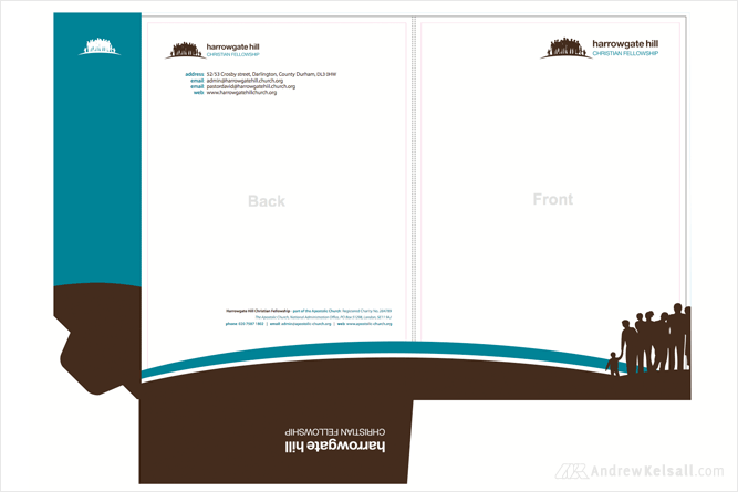
Above: This is how the folder design file looked after completion (Harrowgate Church used their own printers for this, so I don’t yet have a printed example to show).
Church Business Cards and Letterhead Designs
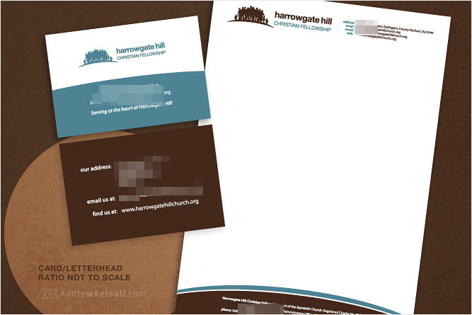
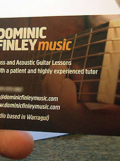
Above: This is the letterhead and business card design. Details have been masked for client privacy reasons.
Web Site Design
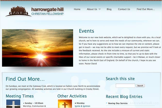
Above: The website design, located at HarrowgateHillChurch.org is based on the WordPress CMS. I purchased a base-theme to build the site upon, which was the preferred option based upon the client’s budget.
Concluding Words
This was a great project to work on—and here's a thanks to all the great people over at Harrowgate Hill Church.
If you would like a free logo design quote, please complete my Church Logo Design form over on my-sister site, Pure Christian Graphic Design.
Any questions? Please leave a comment below…