I have been working on some branding for singer/songwriter Dominc Finley. This article shows the logo design, business cards, letterhead and website I designed for him. Dominic teaches guitar to students in Warragul, Australia.
Note: These images and texts originally appeared on my personnal design blog, Andrew Kelsall Design.
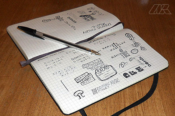
↑ The first stage in the branding process was to design a logo. After asking Dominic to answer some questions about the proposed logo design, I set to work sketching in a Moleskine Notebook.
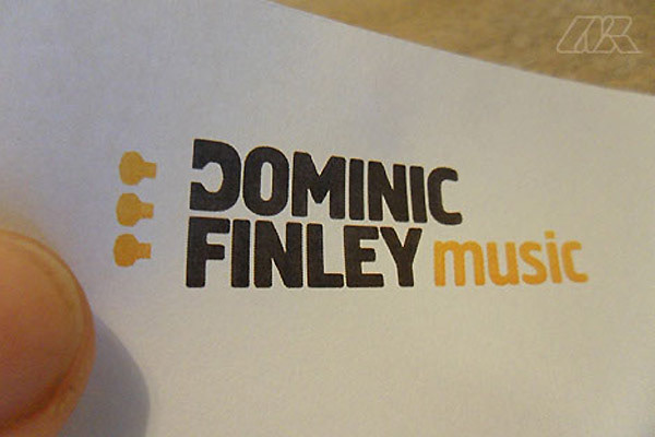
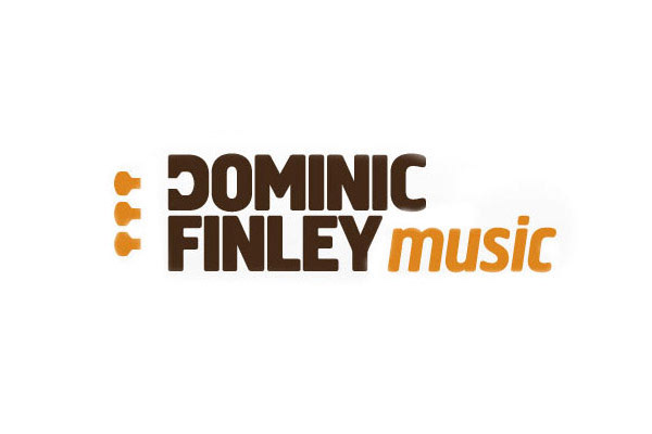
↑ Here is a print-out of the final design. As can be seen, the design is based on guitar-pegs.
Note: I have blurred-out the Phone Number & Address on all images, as this information does not appear on the Dominic Finley website.
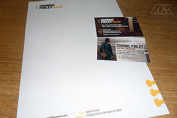
↑ Here is the letterhead and double-sided business card design.
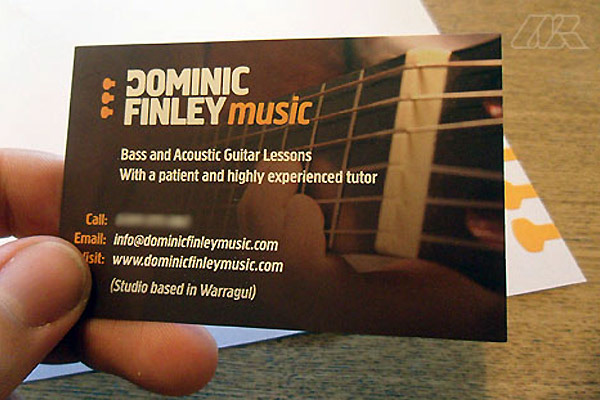
↑ The business card is dual-purpose. The Dominic Finley Music service is advertised only on the front of the card. The card was printed litho in full colour onto 400gsm card.
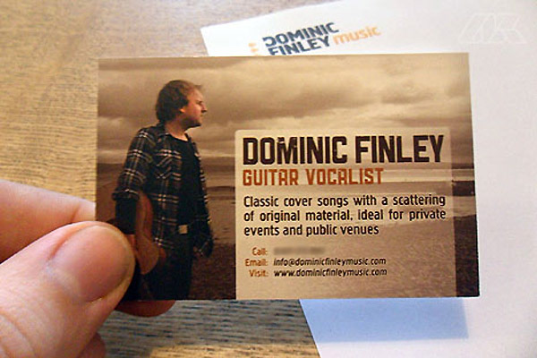
↑ The reverse of the card advertises Dominic’s Guitar Vocalist Services, which are accessible through a separate page on his main site.
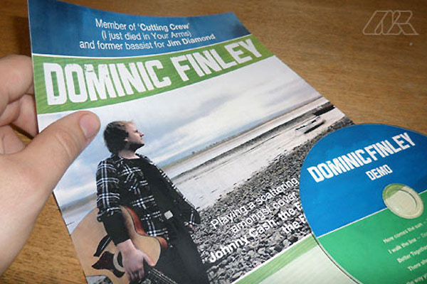
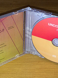
↑ Here is another project for Dominic showing the identity of the separate music service. A poster and promotional CD design are shown here.
Even though the colours used here were green and blue, I chose to keep the brown/orange scheme on the business card as it was “image heavy” already. Adding a different colour scheme on the reverse would have over-complicated it, I decided.
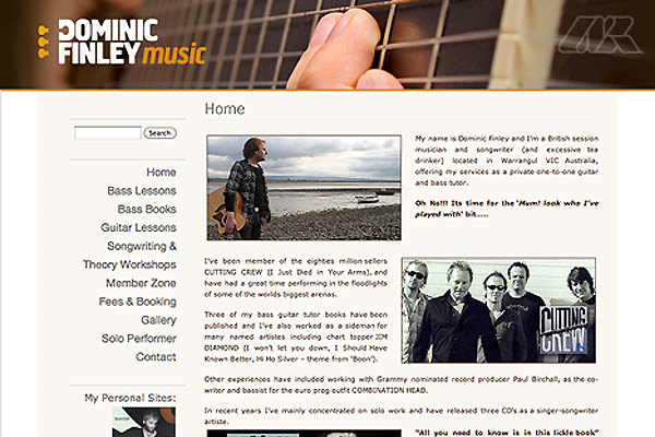
↑ This is the homepage of the website I produced for Dominic. The design is a modified theme powered by WordPress.

↑ Finally, here is how the actual Dominic Finley Music logo appears in “file view”, which appears in my design portfolio. Note how the base peg lines-up the crossbar of the F, while the top one mirrors the negative space of the D.
Conclusion
Dominic required a logo design that could work well with printed material (such as the business cards shown) and web use. The main colour brown which tied the branding together worked well with the orange used, I feel. The typeface I used in the end was Creighton, which I originally purchased to do some poster designs. However, I feel it worked really well here, too.
Need a Logo & Branding Quotation? If so, please head over
to my quote page on Andrew Kelsall Design. Simple!