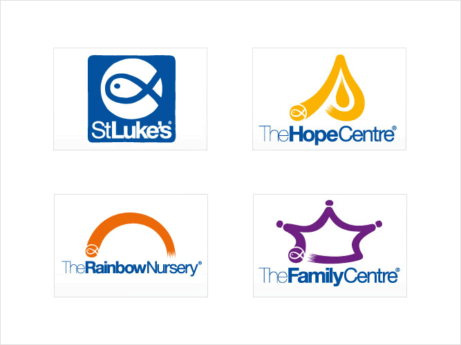
The challenge of the brief was to create a set of designs that were both individual, yet obviously part of a branding and identity structure. For example, if “someone” saw both the St Luke’s logo and the Rainbow Nursery logo, they had to know that the designs were part of the same organisation.
Fortunately, the project had a decent budget (obviously not revealed because of designer/client confidentiality) so I could go ahead and design many pages of designs, along with an explanation of how the designs were to be unified.
If you'd like to see loads more images and case study regarding this project, please head over to Andrew Kelsall Design to see more. You can get a free quote for a logo design and branding here, too.