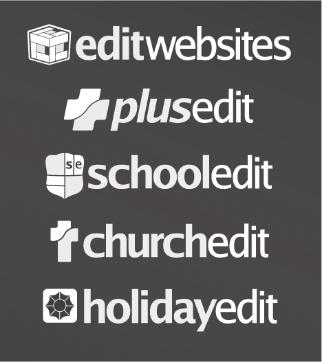
Edit Websites is a powerful web solution that enables its users to effortlessly edit their websites with little or no web-skills. There will be five website services in all, with Edit Websites comprising of Holiday Edit, Church Edit, School Edit and Plus Edit. All of these sites are still in development, except for Church Edit, which will also be re-branded soon.

Project Start
Kyle Cottington, the man behind the whole operation tasked me to design a cohesive set of logos that work both individually and as a whole. As an existing client, Kyle hired me to work on one concept that would work for all five logos.
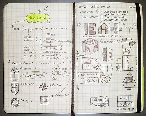
My first step was not to start designing on the Mac, but to conceptualise my thoughts with pen and paper. My tools of choice are a simple black Bic® Ballpoint pen and a MoleSkine® squared notebook. The image below shows how I started the logo design process:
The Idea Behind the Concept
The whole selling point of the Edit website system is editability. With this in mind, I set out to design a set of logos that simply and constructively conveyed this message with the use of shapes or blocks that fit together. This was a simple idea that formed a branding identity that conveyed the right message.
Next Steps
When I sketched-out several pages of designs and some mind-mapping, I designed very rough icons for the logos in Illustrator, presenting them to Kyle as an emailed PDF.
I always include a cover page in the PDF, showing the Job, client number/codes, project name and date. I then proceed to explain the designs and the decisions behind the concepts. The image below shows a typical cover-page layout (text here is blocked-out due to client-designer confidentiality).
The following images show the rest of the six pages from the first set of proofs. I have also highlighted the text adhering to each concept. Also, in this first set of proofs, I have provided scans of some of my sketches as alternate options for Kyle to review. I feel it adds a more personal touch to the whole process, as well as saving time which is better spent in the latter stages of design.
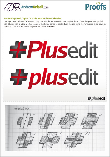
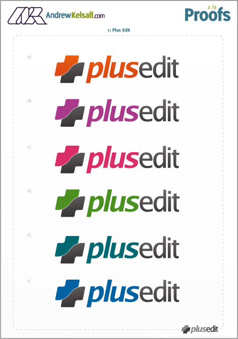
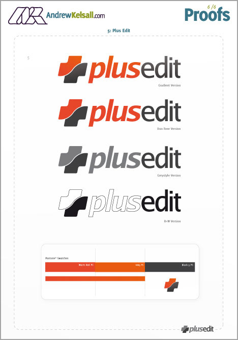
Plus Edit Logo with Capital “P” Variation + Additional Sketches
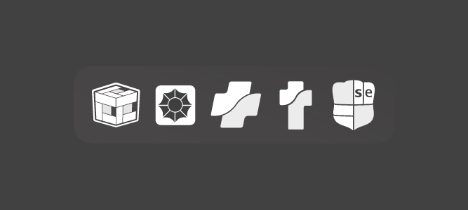
This logo uses a slanted + symbol, very much in the same ethos of your original logo. I have designed the symbol with blocks, with a slightly 3D appearance to show a sense of depth.
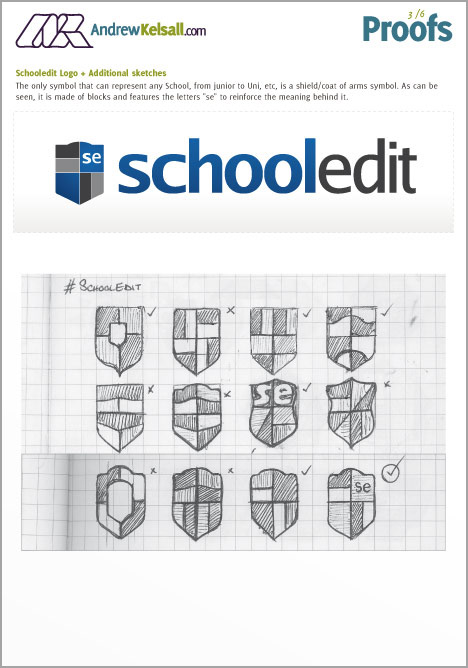
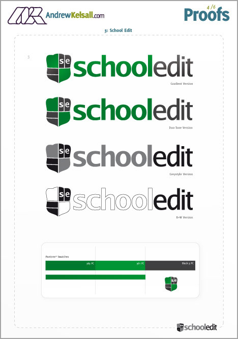
Schooledit Logo + Additional Sketches
The only symbol that can represent any School, from junior to Uni, etc, is a shield/coat of arms symbol. As can be seen, it’s made of blocks and features the letters “se” to reinforce the meaning behind it.
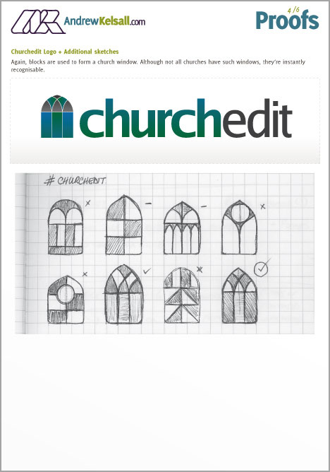
Churchedit Logo + Additional Sketches
Again, blocks are used to form a church window. Although not all churches have such windows, they’re instantly recognisable.
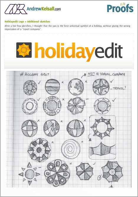
Holidayedit Logo + Additional Sketches
After a fair few sketches, I thought that the sun is the best universal symbol of a holiday, without giving the wrong impression of a “travel company”.
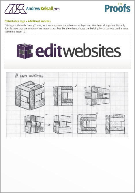
Editwebsites Logo + Additional Sketches
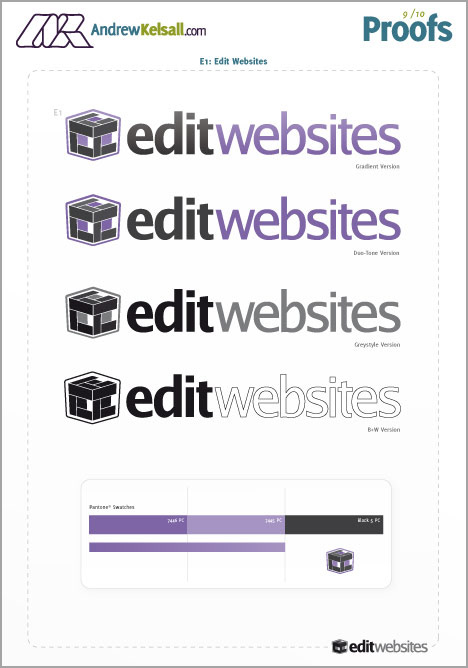
This logo is the only “true 3D” one, as it encompasses the whole set of logos and ties them all together. Not only does it show that the company has many facets, but like the others, shows the building block concept…and a more subliminal letter “E”.
Here is a snap-shot of the Adobe Illustrator® file I was using to create the vector logo forms. I have turned on all the 20+ layers on at once so you can see how I like to just copy, paste and replicate things randomly until I achieve the desired forms. To me, I find it much easier to work this way, rather than constantly lining images up and creating “proper” layer names in these early stages, as it hinders my creativity I feel.
After the first set of logos were reviewed by Kyle, it was agreed that the concept worked, but both the Plusedit and Churchedit logos needed amending. It was thought that the Plusedit emblem resembled an emergency cross, so something less clinical was required.
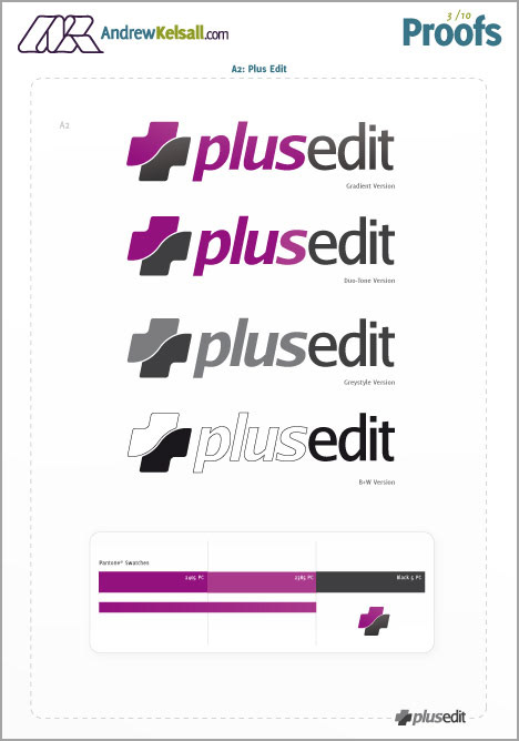
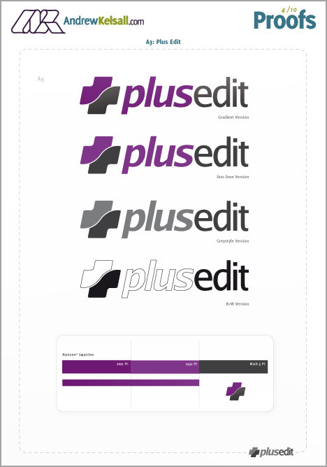
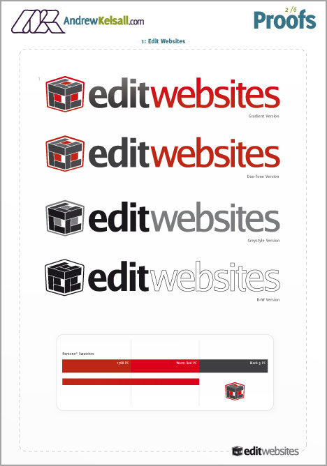
Set 1: Plus Edit Logo. Changed to version 3 from sketches on previous proofs.
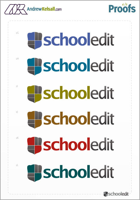
Set 2: School Edit Logo. Shield is curvier and has a more appealing look. 2G-2L show what the logo would look like without the CE letters.
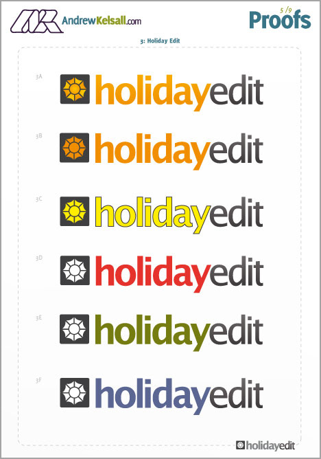
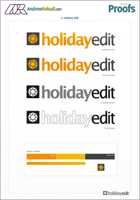
Set 3: Holiday Edit Logo. Colour changes and options.
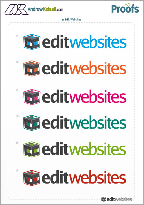
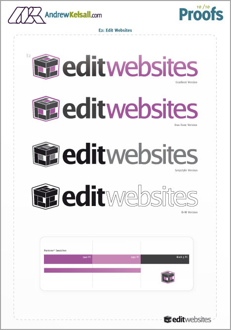
Set 4: Edit Websites Logo. Cube logo recreated with minimal amount of rectangular panels for clarity. Border added for overall aesthetics and appeal. Colour emphasis placed onto the word “websites” to give a more unified look across all logos in the set.
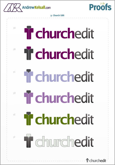
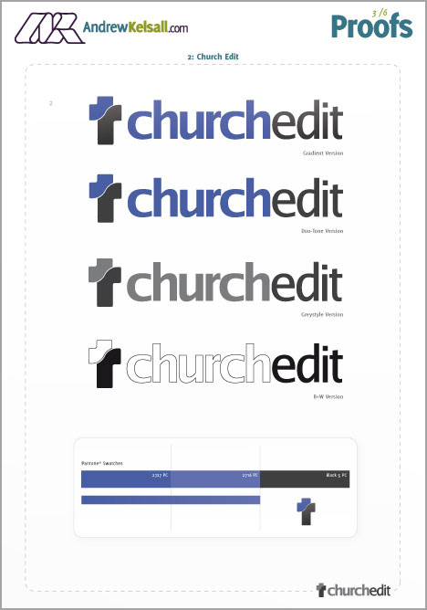
Set 5: Church Edit Logo 1. Crucifix design made into a formation which could resemble a priest or person to some viewers. Matches the graphic styling of the other logos in sets 1-4.
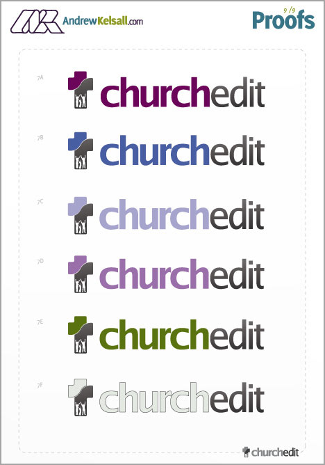
Set 6: Church Edit Logo 2. Crucifix design created in the same style as the Plus Edit icon.
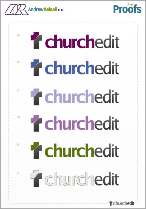
Set 7: Church Edit Logo 3. As Logo 2, but with a family silhouette added. If you want me to explore this option further, using either less people or different poses (i.e., a more conservative approach, with just people stood) please let me know and I will revise it.
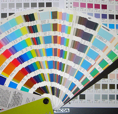
The Image below shows how I selected the Pantone® colours to be used in the logo design. As well as Pantone® Swatchbook (Coated & Uncoated), I had two books from my local printers, which show how the certain swatches will print in CMYK on their presses.
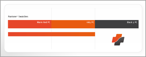
The Image below shows how I choose to represent what Pantone® Colours I proposed. It shows the colours together with their codes. Here ‘PC’ means Pantone Coated (often just referred to as ‘C’). In all likely-hood, Only the darker colour (in this case Black 5 PC) and the darker orange (Warm Red PC – or Warm Red C, depending on the printer) would be used, as the Warm Red could be used as a “gradient-colour” into “gradient-lower-tint“. However, I have chosen to display a 3-colour Pantone® Set for completeness.
Nearing the end of the project, I had made some more changes to the logo designs, namely altering line widths on the School Edit and Edit website logos. Also, I altered the School Edit shield, so it looks more curvy and 3D.
Finally, I produced four separate versions of each logo: Gradient (optional for web use), Duo or Tri-tone Pantone® coloured ones for print use (or simply used online as non-gradient option), Greystyle for print use (fax, etc) and Black & White (B+W).
In the set of PDF proofs below, I have also given a few more colour options:


When all the logo designs were approved, I set about finalising the designs, making sure all the vector paths in Illustrator® were joined, with no stray points. The image below shows the logo designs in outline mode:
After the colours were agreed, this is the final set of proof files I sent Kyle, with the finalised colour combinations and Pantones® included:

The Final Logos
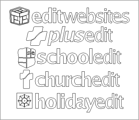
The image below shows the set of logos together without colour, so you can see the formations of the design work, with the bias of colour:
Conclusion
This was a great project to work on—and it was quite a challenge I must admit. Given that there were five logos that needed to work together as a whole—and with 4 different versions of each concept (Pantone®, Gradient, GreyStyle and B+W), this was a project that demanded attention to detail. I enjoyed the process thoroughly, reminding me of another set of logos I produced for St Luke’s Church.
I know this article has been rather long, but I wanted to show the entire design process from start to finish. I’ve been reading other designers’ posts lately, with snapshots of the logo concepts, but lacking the detail on how their designs were presented.
I hope this post has given you an insight into how I work. If you have any questions or comments about this article, please feel free to leave your thoughts below.
HIRE ME to Design Your Logo.
Fill out this Simple Form on my site.