This showcase is a Church logo design process for my logo branding for St Michael and All Angels Church, Solomon Islands.
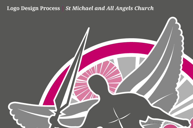
I was approached by Mr Saloouou of St Michael and All Angels Church, Solomon Islands, to design a logo for his church. You can see a preview of the final logo above.
Where are the Solomon Islands?
Well, before I worked on this project, I had no idea. After a quick Google search, I located them off the coast of Australia. Come on, who knew the Solomon were there? Don’t tell me everyone else but me knew…
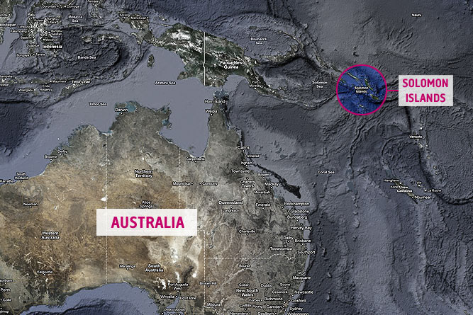
↑ Australia and Solomon Islands map. Base image taken from Google Maps (copyright © Google).
The Logo Design Process
Mr Saloouou and the church were very specific in what they wanted, even the colour. They required a logo that showed St Michael and his Angels. The colour pink was also to be used. With this basic information as a springboard, I set to work creating mockups.
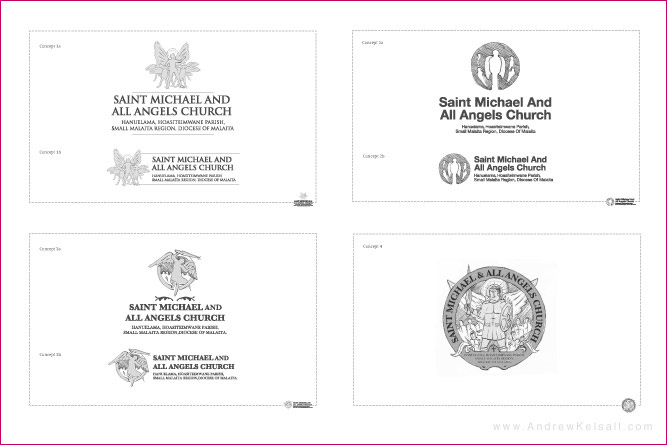
Concept 1 (top-left image): This logo design uses all-capital letters to form the name of the church and location. This helps give the design a sense of authority and boldness. The angels icon used is only a sketch at this point, but it represents how the design would look as a whole.
Concept 2 (top-right image): This design is more modern looking. The icon (represented by a rough sketch) is very simple, showing a lead angel with a few flying ones in the background of the circle. The typography is very modern, and in title-case. The whole idea around this design is ‘simplicity’.
Concept 3 (base-left image): This design, again, uses all-caps in the title and church address. The sketched icon here shows an angel (which is St Michael) yielding a sword. Other angels can be seen behind. 2 curved icons are used above the text to promote a more traditional appearance.
Concept 4 (base-right image): Unlike the other concepts, this logo is a more complicated emblem. The name of the church and address information is contained within a more detailed image of St. Michael and his angels.
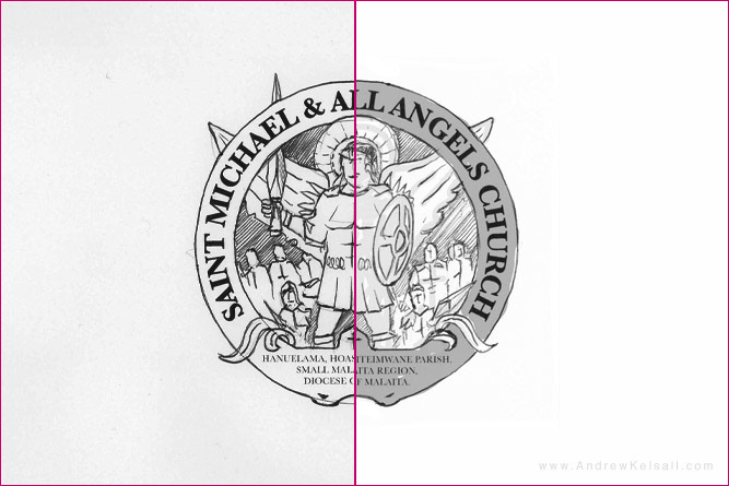
Out of these logo sketches, logo concept 4 (base-right image) was taken further, but with the typographic treatment of concept 3 (base-left image). As can be seen in the last example above, St Michael the Archangel is stood with a sword ready for battle.
Using Sketches with Photoshop
When I was designing the original logo sketches, I used a combination of computer and sketching. Firstly, I designed a very basic logo in Adobe Illustrator®, then printed them out. I then used black pen to sketch over the light-grey outlines of the logo, adding additional detail. Them I scanned the images back-in to my iMac, then imported them into Adobe Photoshop®. The final step was using Alpha-channels to under-colour the logo with grey to simulate marker pen.
Final Logos and Stationary
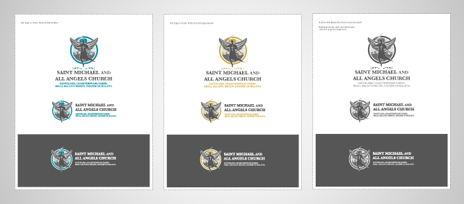
Even though the colour suggestion was pink, I also thought it prudent to show how the logo would look in other colours, such as blue and gold. I also supplied a grey-style version. Final logos included Pantone® Colours.
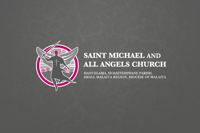
The image below shows the final, chosen, pink and grey logo against a grey-marble background for display purposes:
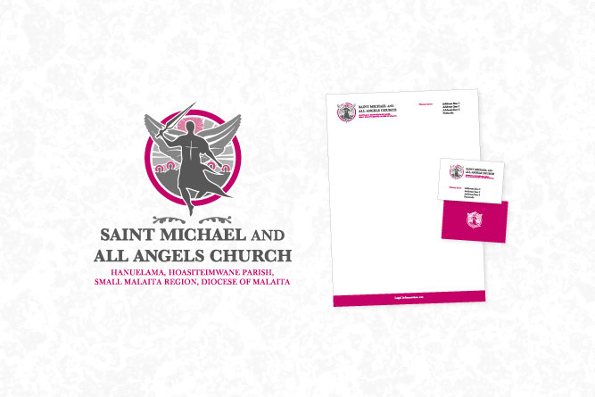
The final image below shows the alternate ‘portrait’ logo I designed, along with the letterhead and business card stationary design:
Conclusion
Unlike some other projects I’ve worked on, the client here had a very clear idea of what was required. The culture is the Solomon Islands is quite different to what it is over here in England, UK. I trusted that what was required—especially the colour-scheme—was suitable for a church over there.
I know this isn’t an exact science here, but I also did some ‘research’ by way of looking at the types of structures and existing street signage by using Google Street-View. I once did this when looking at the surrounding church area for a logo for Harrowgate Church. This at very least gave me a slight additional information to add add to my mental arsenal of ideas.
Need a Logo? You can simply contact me for a
Free Quote over on Pure Christian Graphic Design.