Note: These images originally appeared on my site, Andrew Kelsall Design.
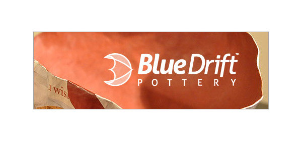
Blue Drift Pottery is a unique company that makes “pottery out of recycled materials” (or upcycling), which was set up by Cathleen Savage and based in Colorado, USA. The Blue Drift website site explains:
After much trial and error, Cathleen developed a working method that allows the bowls and bases to take their own form with a little guidance from the artist. The result is organically shaped vessels that would be difficult to reproduce by machine. And no two pieces are alike. Some vessels use other found and reused items, such as latex rubber tubing and old jewellery.
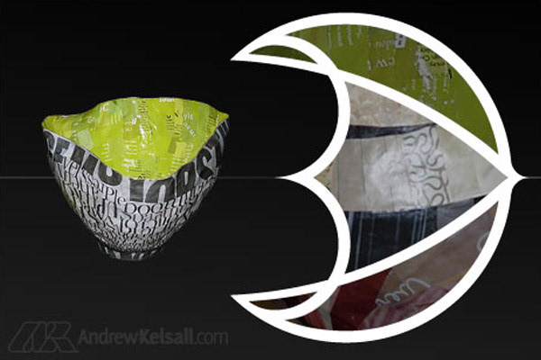
Cathleen contacted me regarding a logo design that would convey the uniqueness of the pottery she made. The images below show some the vase’s and their very distinct and contemporary style:
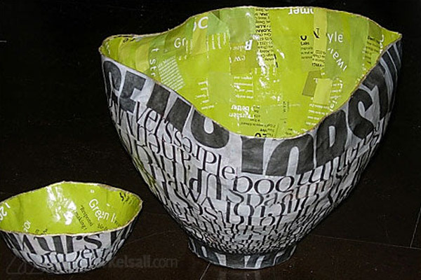
↑ Vase by Blue Drift Pottery
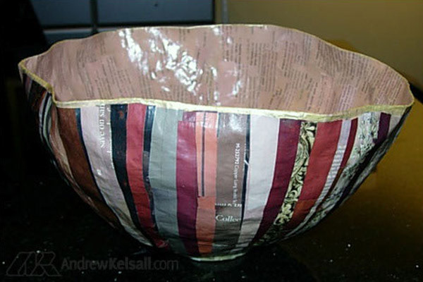
↑ Maria Vase by Blue Drift Pottery
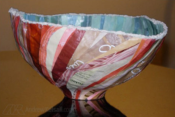
↑ Shell Vase by Blue Drift Pottery
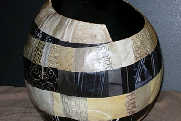
↑ Spiral Vase by Blue Drift Pottery
At first glance, it would seem like a fairly simple task to create a logo for this company. Not so. Whilst visions of pottery-inspired logotypes spring to mind, a questionnaire I emailed Cathleen revealed to me that Blue Drift wasn’t just limited to Pottery.
In the future, Blue Drift may create Jewellery, too. The word ‘pottery’ was required to be interchanged with the word ‘jewellery’ for a second logo at a future date. In light of this critical information, I set about creating a unique logo for a very unique requirement.
The Logo Design Process
After reviewing the detailed answers I received from the questionnaire, my mind was buzzing with ideas. In contrast to my normal work process, I didn’t do any mind mapping. Whist the mind-mapping can be very important, there are no solid rules when it comes to getting ideas on paper. Sometimes, letting your creativity flow is more important that following a rigid process.
↑ As always, I sketched out my ideas about the logo design straight down onto my Moleskine Notebook. Even though this photo shows a landscape view of my drawings, the very icon a drew was close to the final design. Sometimes, first impressions are the correct ones.
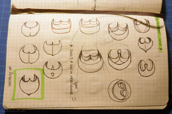
↑ Here, I highlighted another possible candidate icon for the logo design.
↑ This was another variation of my first and initial idea, although I felt this type of icon was becoming a little too out-there, so to speak.
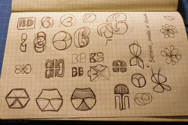
↑ More concepts explored. As can be seen, I use graph-paper to help structure my concepts. Sometimes, the squares can be a hindrance to the design process, but not in this case.
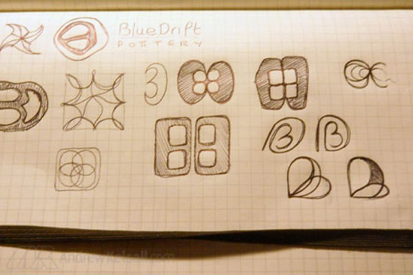
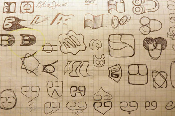
↑ More conceptual work, where I explore using an icon based on the letter B.
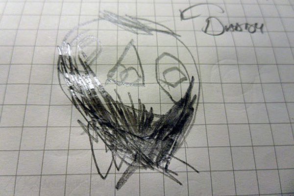
↑ After a break from designing, my son drew a picture of my on a spare notebook page. I’m not sure if I looked that unshaven—but maybe my eyes did look somewhat wide-open from too much coffee! So, my next set of sketches were done the following day after some rest.
↑ After several rounds of loosely sketching icons, I collated my chosen concepts onto a single page for review. Sketching them out all again somehow helped me to focus on the shapes and forms in a very personal way. If I worked straight onto the Mac, I would loose this connection with the initial design work.
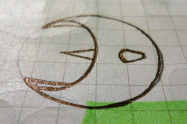
↑ Oh, one more concept that popped into my mind at the last hurdle—a 3D B shape.
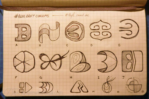
This is my write-up on the first set of proofs I sent to Cathleen:
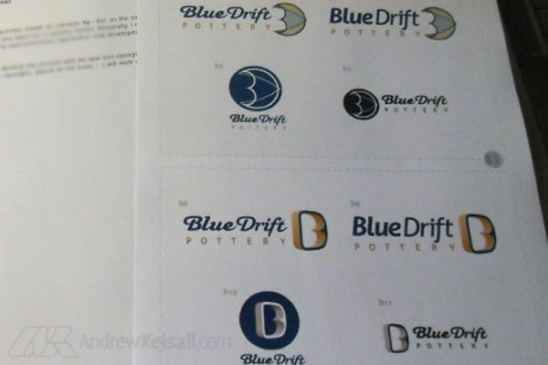
Concept a (page 3/4) shows a design concept based upon the letters B and D, combined into one symbol. This is the simplest of all the designs I have done for you. My main focus here was to create an icon that could easily look like a very clear stamp-styled symbol, that will work at even the smallest of sizes. As can be seen in all 3 variations (a1, a2 and a3), the logo can be used in different proportions and sizes to fit a variety of applications.
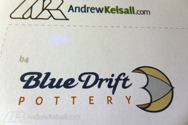
Concept b (page 3/4) shows a design concept which is, as I consider, “really far-out there” in terms of its dynamic nature. After reviewing your questionnaire, I formulated a concept that would enable the very unique nature of your business to be translated into a very modern and forward-thinking icon. The icon itself contains, although subliminally, the letters B and D in a very un-obvious way. It has a very 3D style and attempts to capture the uniqueness of your pottery (and future jewellery products?) with use of segmented blocks. This logo would also translate very well into a web-2.0 style logo, whereby gradients and even textures could be used in these segments to convey different aspects of your company, i.e., Pottery and Jewellery.
Concept c (page 4/4) shows a design concept that aims to capture the imagination and the ethos of your pottery works. After viewing your works online via Twitter Pics, etc, I designed a very fluid logo that represents the style of work you undertake. Again, a subliminal B (inner ovals) and D (outer shape) are present, but in a very limited way. The icon (like the rest of the designs) can be used on it’s own or with the text, too. *I have designed once of the B+W logos with the word Jewellery, so you can see how any of these logo designs will translate.
Concept d (page 4/4) is an addition font that I though may work, instead if the sans-serif styles in use
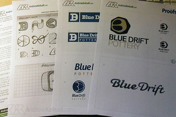
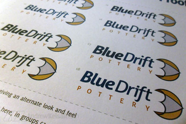
↑ After setting to work creating vector versions of 3 chosen icons in Illustrator, I spent a fair amount of time researching typefaces for the logo design. You’ll notice here that not only did I present three sets of logo concepts, but included some scans of my final pen drawing as additional options.
They were neat and tidy, and I thought including them could present Cathleen with more options. I don’t do this in every logo design. Sometimes too many options is a bad idea, but in this case, I thought it prudent to do so.
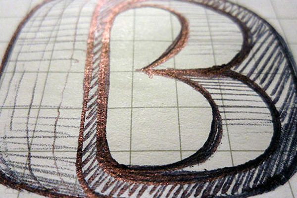
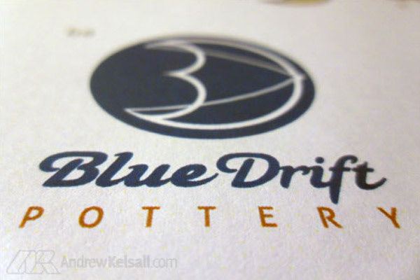
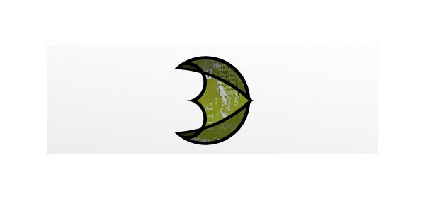
↑ This is how the B concept (3rd image above) turned out on the first set of proofs.
↑ Pleasingly for me, Cathleen liked my very first initial idea I produced. After finalising the first proof of the initial logo icon, I experimented with some differently-styled typography for Blue Drift.
↑ This is how the icon looked with a little colour, set to the right of the typography.
↑ Here, I have selected varied tones of the chosen colour scheme.
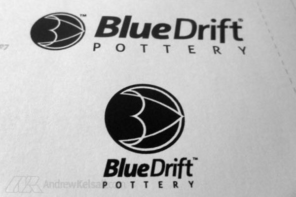
↑ Here are two black and white variations of the chosen concept. Notice the TM symbol, as the logo is due to be registered by Blue drift.
↑ This version of the logo is crafted for possible use as a sticker-design (to place under the upcycled pottery). It was just an idea that wasn’t taken any further.
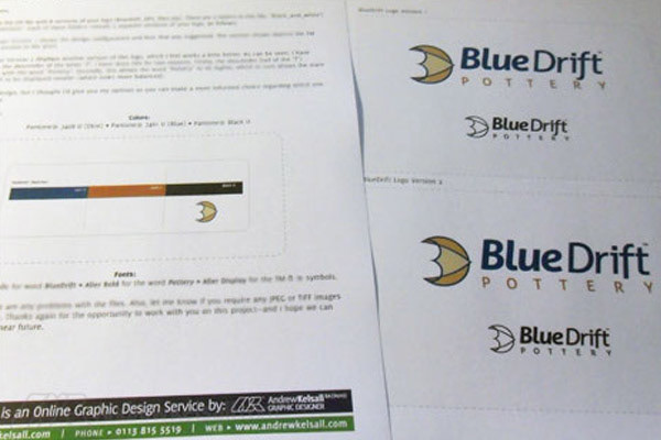
↑ When the formation of the logo was complete, I suggested a Pantone® colours, based on the chosen blur/brown scheme.
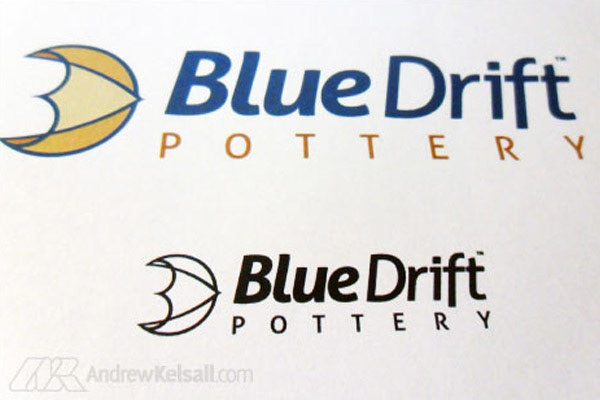
↑ This is a photo of a printout of the logos, showing the colour and B+W versions.
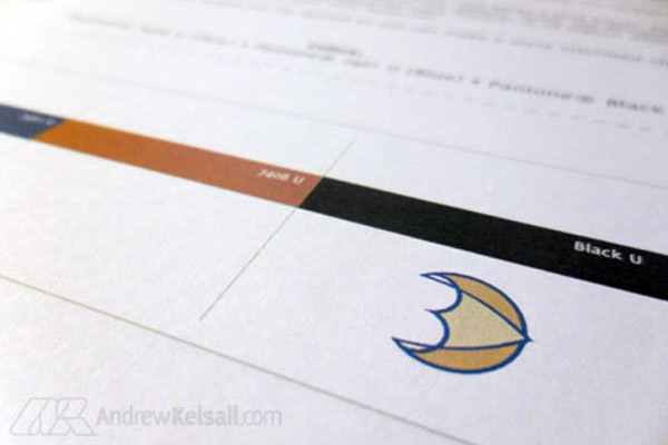
↑ For the B+W version of the logo, I chose Pantone Black U. For more information about other Pantone® Black choices, you may want to take a look at my article The Professional Designer’s Guide to using Black.
The final logo typography was based on the following weights of Aller:
• Aller Italic & Aller Bold Italic for word BlueDrift
• Aller Bold for the word Pottery
• Aller Display for the TM & ® symbols
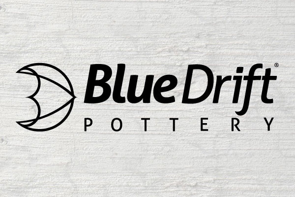
↑ Final Black & White version
Branding Concepts
Whilst designing the logo, I couldn’t help but think about the varied ways that this logo could be presented as part of a branding-style for both print and web use. Here are a few visions of this design style I had in mind:
↑ Here, I have experimented by overlaying a black version of the logo with transparent areas in the logo icon.
↑ Same in white, with equal impact.
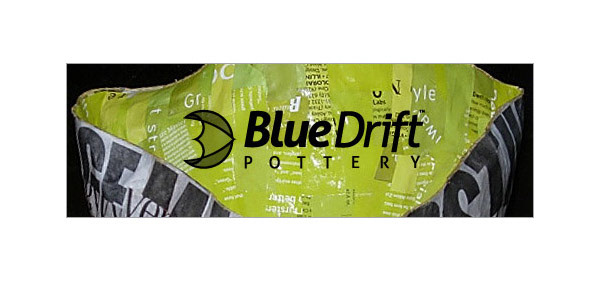
↑ Another idea I had was to encompass any pattern with the confines of the icon. I can see where this could be implemented.
↑ Just for fun, but I think it looks the part.
Conclusion
This was a fantastic project to work on. I also learned a lot whilst producing the designs. My techniques were refined further and I feel that I produced a logo design that truly represented the Blue Drift Pottery brand.
What do you think? I’d love to hear any constructive criticism or your opinions on the designs…
Need a Logo & Branding Quotation? If so, please head over
to my quote page on Andrew Kelsall Design. Simple!